If you want me to keep making amazing free resources for you, I would really appreaciate your feedback and support on my Product Hunt launch! 🤗️
🤖️ To See Code, Click on One of The Links
Introducing 100 Modern CSS Buttons: Every style that you can imagine. This comprehensive collection offers a wide range of button styles to enhance your web design projects. To access the code and explore the various options, simply click on one of the links below. If you enjoy these free resources, your feedback and support on my Product Hunt launch would be greatly appreciated! 🤗️
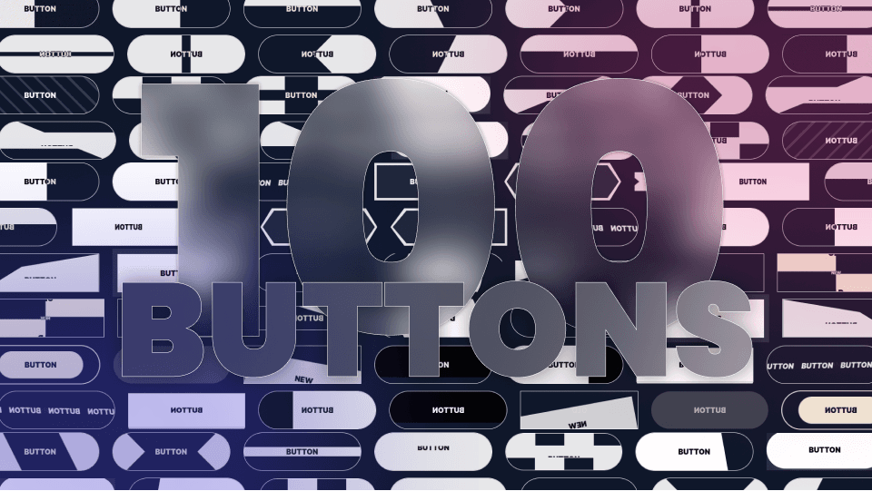
100 Modern CSS Buttons
| Preview | Link | Description |
|---|---|---|
| Basic | CSS Button that changes color on click or hover. | |
| Inverted Triangles | CSS Button slides its two inverted triangles to the middle on click or hover. | |
| Line Slide | CSS Button that slides its pseudo-element underline on hover or click. | |
| Don’t Cross The Line | CSS Button that crosses over itself and expands on hover or click. | |
| Slicer And Marquee | CSS Button that slices its background and cycles its content vertically on click or hover. | |
| Zoom In And Text Rotate | CSS Button that slides two inward-pointing pseudo-element triangles to the center on hover or click. | |
| Alternate Blocks And Text Flip | CSS Button that slides its four alternate blocks and flips its text vertically on click or hover. | |
| Slide Right | CSS Button with background that slides right on click or hover. | |
| Tilted diagonal | CSS Button that slides its increasingly tilted diagonal to the right on click or hover. | |
| In And Out | CSS Button that slides its background to the right on click or hover and more to the right again on click or hover. | |
| Bubble Right | CSS Button that slides its circular background to the right on click or hover. | |
| Marquee Sign | CSS Button that moves copies of its text horizontally and at an angle on click or hover. | |
| ShapeShifter | CSS Button that morphs one side of its border into a triangle pseudo-element on click or hover. | |
| Click To Fill | CSS Button with background that fills it up vertically on click. | |
| Double ShapeShifter | CSS Button that morphs both sides into a triangle pseudo-element on click or hover. | |
| X ShapeShifter | CSS Button that morphs into an X using pseudo-elements on click or hover. | |
| Fold Middle | CSS Button that folds from the middle using CSS 3D Transforms on hover or click. | |
| Fold One Side | CSS Button that folds from one side using CSS 3D Transforms on hover or click. | |
| Arrow Slide + Text Rotate | CSS Button that slides its triangular background from the left to the right and rotates its text on hover or click. | |
| Slide Down | CSS Button with backgrounds that slides down on click or hover. | |
| Bubble Up + Text Rotate | CSS Button that slides its bubbly radial background to the bottom and rotates its text on hover or click. | |
| OverFold | CSS Button that moves one corner from the bottom right to the top left to reveal its background on hover or click. | |
| Focus In | CSS Button that focuses its border in on hover or click. | |
| Cover Over | CSS Button that has a pseudo-element background going over it and out on hover or click. | |
| Enlarge | CSS Button that fills up its background radially from the center and scales up on hover or click. | |
| Slanted | CSS Button that tilts its background from the top left corner on hover or click. | |
| Split Reveal | CSS Button that reveals new text by splitting it horizontally from the center on hover or click. | |
| Split Reveal Alternate | CSS Button that reveals new text by splitting it alternately from the center on hover or click. | |
| Split Reveal Horizontal | CSS Button that reveals new text by splitting it horizontally from the center on hover or click. | |
| Slide Reveal | CSS Button that reveals new text by sliding it to the right on hover or click. | |
| Diagonal Swipe | CSS Button that slides its diagonal background to the right on click or hover. | |
| Slide Reveal + Text Down | CSS Button that reveals new text by sliding it to the right and sliding the old text down on hover or click. | |
| Pill Shrink | CSS Button that scales its pill-like background down on hover or click. | |
| Pill Halo | CSS Button that focuses in its pill-like border on hover or click. | |
| Glow Button | CSS Button that has a moving and glowing border on hover or click. | |
| Rotate Reveal | CSS Button that reveals new text by rotating it in from the bottom left on hover or click. | |
| Double Slide Down | CSS Button that slides its two backgrounds successively to the bottom on hover or click. | |
| Double Slide Right | CSS Button that slides its two backgrounds successively to the right on hover or click. | |
| 3D Rotate Down | CSS Button that rotates down using 3D Transforms on hover or click. | |
| 3D Rotate Right | CSS Button that rotates right using 3D Transforms on hover or click. | |
| 3D Rotate Left | CSS Button that rotates left using 3D Transforms on hover or click. | |
| 3D Rotate Down | CSS Button that rotates up using 3D Transforms on hover or click. | |
| Rush Triangle | CSS Button that slides its triangular background to the right on click or hover. | |
| 3D Float | CSS Button that has a large box shadow and that tilts down using 3D Transforms on hover or click. | |
| 3D Button Click | CSS Button that pushes itself down in 3D space on hover or click. | |
| Striped Zebra | CSS Button with striped background that scrolls on click or hover. | |
| Letter Dance | CSS Button that slides its characters down successively one after the other on hover or click. | |
| Letter Dance 2 | CSS Button that slides its characters up and down alternately on hover or click. | |
| 3D Button 2 | CSS Button that simulates 3D using html elements and that pushes down on hover or click. | |
| Rainbow Fill | CSS Button that reveals its fun rainbow gradient background sitting inside of its rainbow gradient image border on hover or click. | |
| Pulse | CSS Button that pulsates on hover on hover or click. | |
| Offset | CSS Button that moves its background back into-place on hover or click. | |
| Backdrop Blur | CSS Button that overlays a blurry layer on its background on hover or click. | |
| Tada | CSS Button that plays the TADA animation from animate.css on hover or click. | |
| Double Horizontal | CSS Button that slides its two backgrounds horizontally to the middle on click or hover. | |
| Jello | CSS Button that plays the jello animation from animate.css on hover or click. | |
| Alternate Blocks | CSS Button with four blocks on alternate sides that move to the center on click or hover. | |
| Rubberband | CSS Button that plays the rubberband animation from animate.css on hover or click. | |
| Wobble | CSS Button that plays the wobble animation from animate.css on hover or click. | |
| Head Shake | CSS Button that plays the head-shake animation from animate.css on hover or click. | |
| Heart Beat | CSS Button that plays the heart-beat animation from animate.css on hover or click. | |
| Flash | CSS Button that plays the flash animation from animate.css on hover or click. | |
| Text Slide | CSS Button that slides a copy of its text vertically with another color on hover or click. | |
| Border Snake | CSS Button that has borders that fill-up one after another on hover or click. | |
| Snakes Alternate | CSS Button that has borders filling up from the parallel sides on hover or click. | |
| Snakes Meet | CSS Button that has borders filling up to meet at 2 points on hover or click. | |
| Double Vertical | CSS Button with two backgrounds that slide vertically to the center on click or hover. | |
| Quadruple Corners | CSS Button with 4 corners that all converge to the middle on click or hover. | |
| Snakes Center | CSS Button that has borders filling up from the center on hover or click. | |
| Material Ripple | CSS Button that fills up its background radially from the center then fades out on hover or click. | |
| Neumorphism 1 | CSS Button that has a fluffy shadow that moves to the inside on hover or click. | |
| Neumorphism 2 | CSS Button that has a fluffy shadow and text with a 3D effect using text shadows and that moves to the inside on hover or click. | |
| Neumorphism 3 | CSS Button that has a fluffy shadow that smoothly moves to the inside on hover or click. | |
| Neumorphism 4 | CSS Button that moves down on hover or click. | |
| Neon | CSS Button that has borders filling up slowly then revealing a large neon shadow on hover or click. | |
| I Want Attention | CSS Button that keeps pulsing on hover or click. | |
| Hug | CSS Button that moves its background from the outside to the inside on hover or click. | |
| Hug 2 | CSS Button that moves its background closer from the outside to the inside on hover or click. | |
| Float Up | CSS Button that floats up with a box shadow below it on click or hover. | |
| Double Diagonal | CSS Button that slides its two diagonal backgrounds horizontally to the center on click or hover. | |
| Progress Fill Right | CSS Button that has a background that slowly fills up with a progress animation on hover or click. | |
| Progress Fill Up | CSS Button that has a background that slowly fills up vertically on hover or click. | |
| Progress Shrink Vertical | CSS Button that shrinks into a progress-bar vertically on hover or click. | |
| 3D Progress | CSS Button that tilts in 3D space to reveal a horizontal progress-bar on hover or click. | |
| Elastic Progress | CSS Button that shrinks into a horizontal progress-bar in a smooth and elastic animation on hover or click. | |
| Letter Dance 3 | CSS Button that double-fills its background and plays an elastic animation with its characters on hover or click. | |
| Circular Charge | CSS Button that has a circular border that is clipped and fills up then fills up the background on hover or click. | |
| Icon Pulse | CSS Button that scales its background like a pulse on hover or click. | |
| Slicer | CSS Button that slices its background in half on click or hover. | |
| Icon Slide | CSS Button that slides vertically inside its borders on hover or click. | |
| Double Triangle | CSS Button that slides its two triangular backgrounds horizontally to the center on click or hover. | |
| Gooey | CSS Button that moves two circles closer to each other that have a gooey and slimy effect on hover or click. | |
| Seizure Glitch | CSS Button that plays an RGB split animation on hover or click. | |
| HandDrawn 1 | CSS Button that has borders mimicking hand-drawn edges on hover or click. | |
| HandDrawn 2 | CSS Button that has borders mimicking hand-drawn edges and floats up on hover or click. | |
| Icon Zoom | CSS Button that scales down inside its borders on hover or click. | |
| Icon Focus | CSS Button that has a border scaling in on it on hover or click. | |
| Progress Fold | CSS Button that paper-folds one side to reveal a progress-bar on hover or click. | |
| Sandwish | CSS Button that moves up many shadows successively on hover or click. |
Related Posts


