That’s a fantastic observation! Buttons truly are the unsung heroes of the web, serving as gateways to the dynamic interactions we depend on. Let’s get started with creating a whimsical 3D button. This tutorial will walk you through designing a visually captivating and interactive button using HTML, CSS, and a sprinkle of JavaScript for added interactivity.
Building a Magical 3D Button
To create a whimsical and engaging experience, we can customize the look and add interactivity to our Magical 3D Button. By using CSS, we can apply hover and active effects with transformations and box shadows. Additionally, JavaScript can be used to introduce a playful bounce effect when the button is clicked. With these steps, you can enhance your website’s aesthetic and create an enjoyable user experience.
Step 1: HTML Structure
First, we need a basic HTML skeleton to house our button. Here’s how it starts:
<!DOCTYPE html>
<html lang="en">
<head>
  <meta charset="UTF-8">
  <meta name="viewport" content="width=device-width, initial-scale=1.0">
  <title>3D Button</title>
  <link rel="stylesheet" href="styles.css">
</head>
<body>
  <div class="button-container">
    <button class="whimsical-button">
      Click Me!
    </button>
  </div>
  <script src="script.js"></script>
</body>
</html>
Step 2: Styling with CSS
Here’s where we add the magic to make our button feel like it’s popping out of the screen.
/* styles.css */

body {
  margin: 0;
  display: flex;
  justify-content: center;
  align-items: center;
  height: 100vh;
  background: linear-gradient(135deg, #f6d365, #fda085);
  font-family: Arial, sans-serif;
}

.button-container {
  perspective: 1000px;
}

.whimsical-button {
  background: linear-gradient(145deg, #ff7eb3, #ff758c);
  border: none;
  border-radius: 12px;
  padding: 15px 30px;
  font-size: 18px;
  font-weight: bold;
  color: white;
  cursor: pointer;
  box-shadow: 0 8px 15px rgba(0, 0, 0, 0.2);
  transform: translateZ(0);
  transition: transform 0.2s ease, box-shadow 0.2s ease;
}

.whimsical-button:hover {
  transform: translateZ(15px);
  box-shadow: 0 12px 20px rgba(0, 0, 0, 0.3);
}

.whimsical-button:active {
  transform: translateZ(5px);
  box-shadow: 0 6px 10px rgba(0, 0, 0, 0.2);
}
Step 3: Adding Interactivity with JavaScript
Let’s make the button even more engaging by adding some JavaScript for a playful effect, like a bounce when clicked.
// script.js

const button = document.querySelector('.whimsical-button');

button.addEventListener('click', () => {
  button.style.transform = 'translateZ(25px) scale(1.1)';
  setTimeout(() => {
    button.style.transform = 'translateZ(0) scale(1)';
  }, 150);
});
Step 4: Customizing the Look
You can tweak the colors, gradients, and shadows to make the button fit your website’s aesthetic. For example:
- Adjust the
backgroundproperty for different gradients. - Modify the
box-shadowfor a softer or sharper effect. - Change the
border-radiusfor a more rounded or angular button.
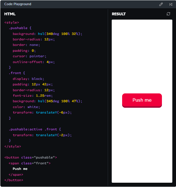
Final Result
When you hover over this button, it lifts off the screen. When clicked, it playfully “pops” forward, creating a delightful tactile feel for the user. Combined with your site’s theme, this whimsical 3D button can make an ordinary interaction extraordinary.
Let me know if you’d like additional features, such as animations or sound effects!
Related Posts


